Spar2U: Grocery Delivery
Freeing up personal time for shoppers, by reducing the effort and friction of everyday grocery shopping, through Spar2U’s home delivery experience.
00

problem
At the start of the project, Spar South Africa had a web app serving as a temporary platform in select locations. Recognising the growing demand for grocery delivery in South Africa, they needed to swiftly launch an app that customers could adopt with ease. With user expectations already shaped by competitors, PlusNarrative was able to deliver a familiar, intuitive experience, refined through UX improvements that supported everyday shopping behaviours.
solution
Overall, the project was a success and gained notable traction despite being a late entry into the market. Constant usability testing and user interviews formed the backbone of the process, and rapid iterations helped drive meaningful improvements throughout. It was a rewarding and energising project to be part of, especially during a fast-paced and critical delivery phase, with a strong team and a clear product vision.
My objectives were to focus primarily on shopping flows that specifically related to ‘Special offers’, ‘variable weighted products’, ‘substituted products’, ‘reordering’, and general UI refresh throughout the user journeys.
RESEARCH
Competitor audits & lightning demos: laid the groundwork for understanding complex functions like ‘items priced by weight’, ‘substitutions’, as well as best practices for the more standard patterns and journeys.
Feedback from the existing beta release: helped us identify where UI improvements were needed.
Regular stakeholder meetings: were required in order to adhere to Spar’s international guidelines for app architecture & core patterns.
One-on-one usability testing: (8 people) validated key assumptions and prompted us to revisit some solutions.
Outcome 01
Optimising top-level category card layouts for better browsing

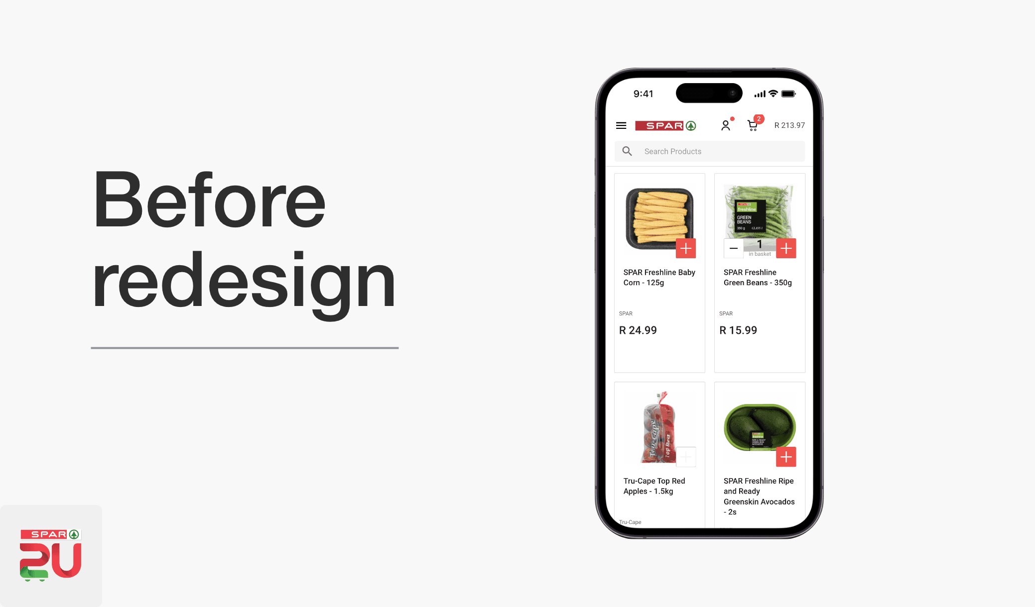
The above user feedback refers to the SPAR2U web app prior to the redesign and development of the native mobile app.
Before redesign:
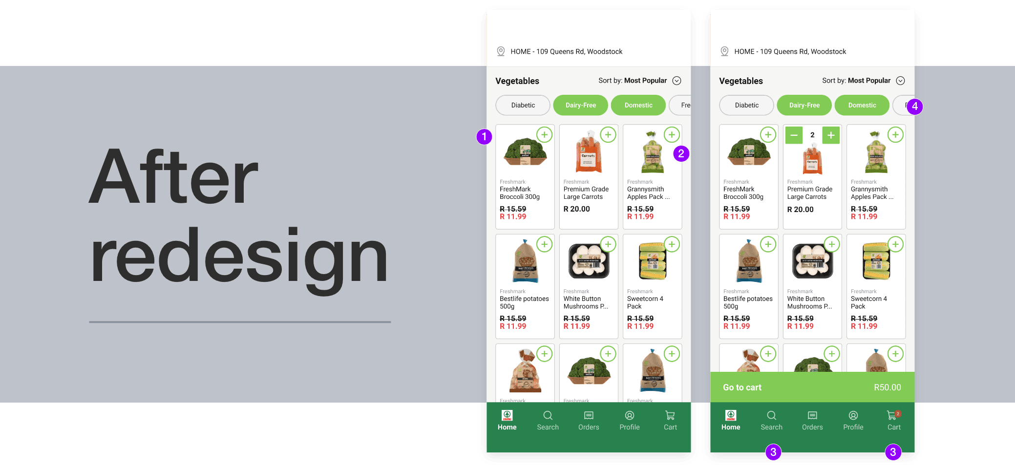
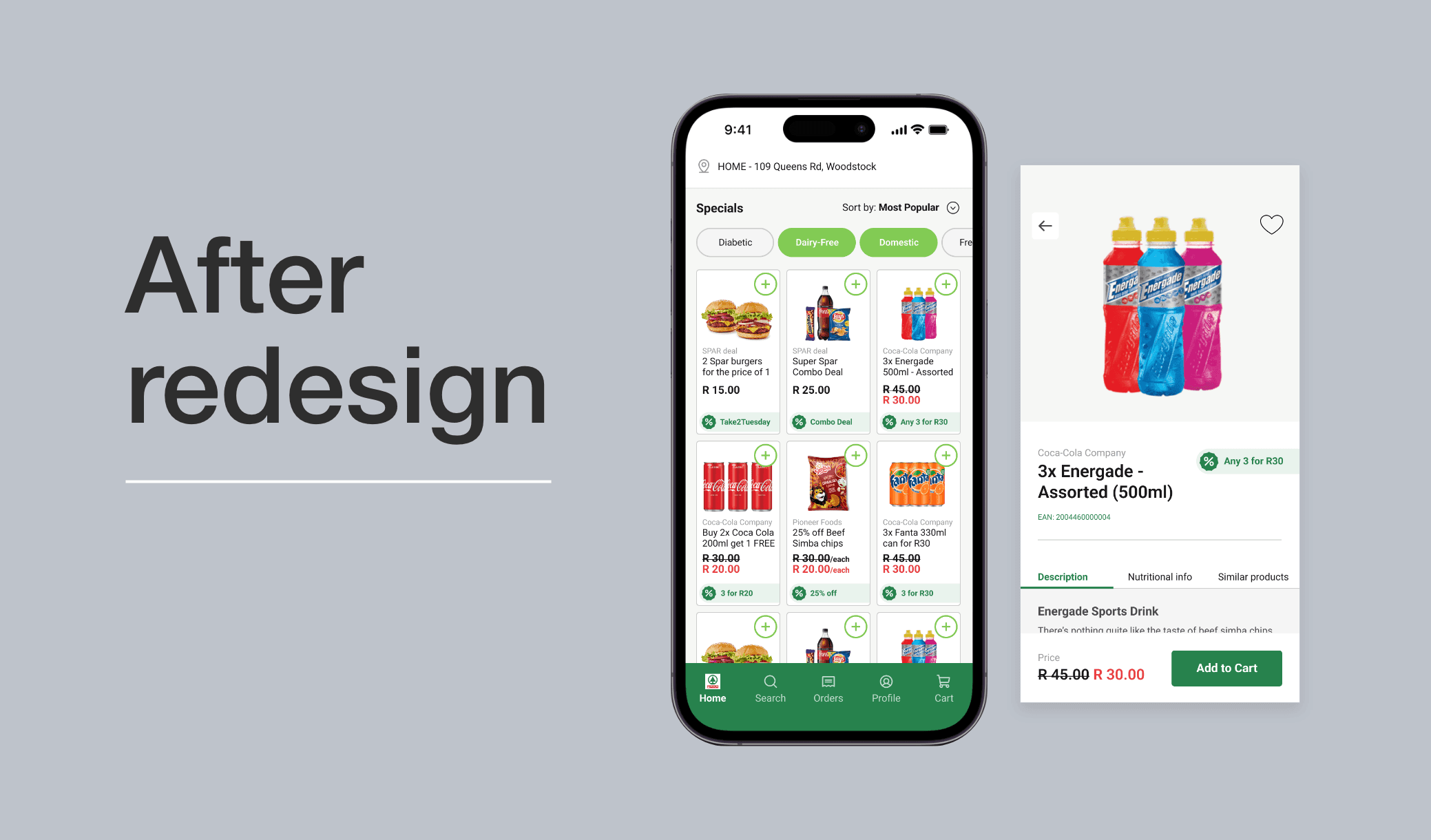
The category page layout was redesigned, and made better use of the space to allow for the user to see more items at once. This was done by:
Key UI changes highlighted below:
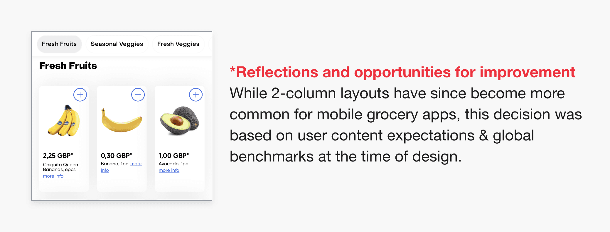
Shifting from a 2-column grid to a 3-column grid, based on usability testing, beta review & stakeholder request.
Moving key action buttons to the top of each card to enhance usability & establish clearer hierarchy for price and description.
Moving “Search” & “Cart” to the bottom navigation for easier reachability.
Introducing filter chips and a ‘sort’ function to help users find items more easily.
Outcome 02
Clarifying deals through stronger visual hierarchy.
Before
Based on Hick’s Law and user feedback, the visual hierarchy was cluttered, causing the transparent promotional UI component to blend into surrounding content and become difficult to notice.

After
Usability testing and interviews informed a cleaner, more focused layout that made offers and discounts visually unmistakable for SPAR. We intentionally prevented UI elements from overlapping the product image to avoid obscuring key product details in edge cases.
Outcome 03
Creating confidence during final checkout selection.
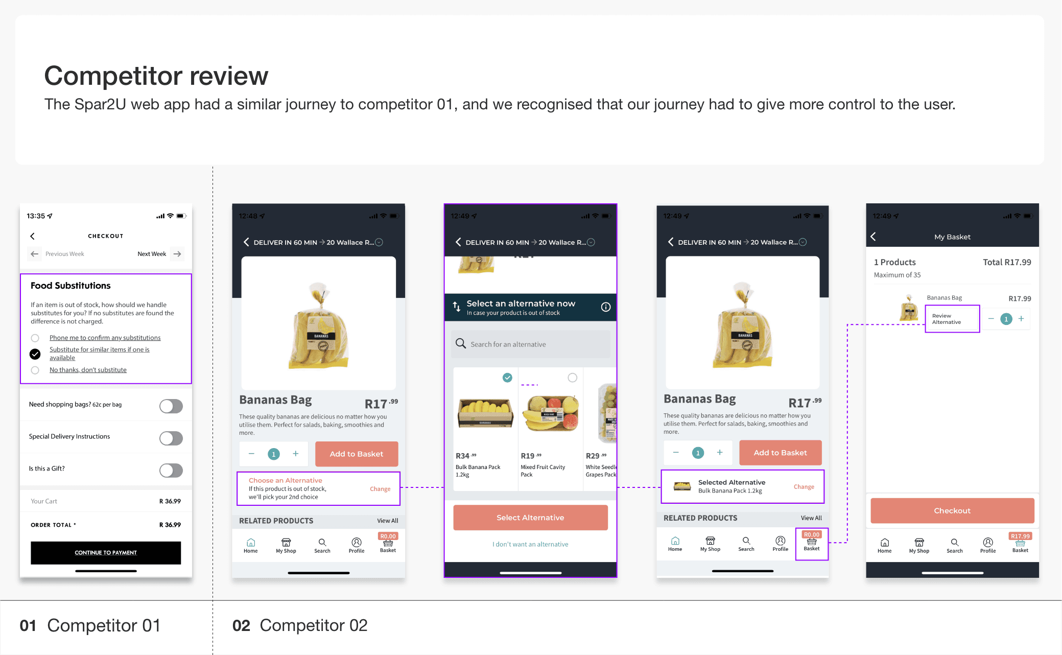
In an effort to better understand how a shopper would select a substitute/alternative product we reviewed all competitors processes to achieve this. Only 2 of the competitors offered this option:
At the time competitors offered a basic solution that didn’t provide options, but allowed the in-store shopper to make the choice for the user.
While the strongest competitor offered the most comprehensive substitute flow among competitors, we identified a gap during their checkout process:
"users had to click through to another screen to confirm which substitute they had selected."
Competitor approach
Substitute selection was handled late in the journey, often requiring additional screens or defaulting the choice to the in-store shopper.
Our solution focused on finishing strong on checkout by reducing cognitive load and improving clarity for the user. We did this by:
Adding a preview of the selected substitute, including key product details such as name, weight (if applicable), and price per unit. This gave users immediate visual confirmation without requiring additional steps.
Enabling users to change the substitute directly within the checkout flow, eliminating the need to click through multiple steps.
Spar2U approach
Substitute choices were made explicit at checkout, giving shoppers immediate confirmation and control without leaving the flow.
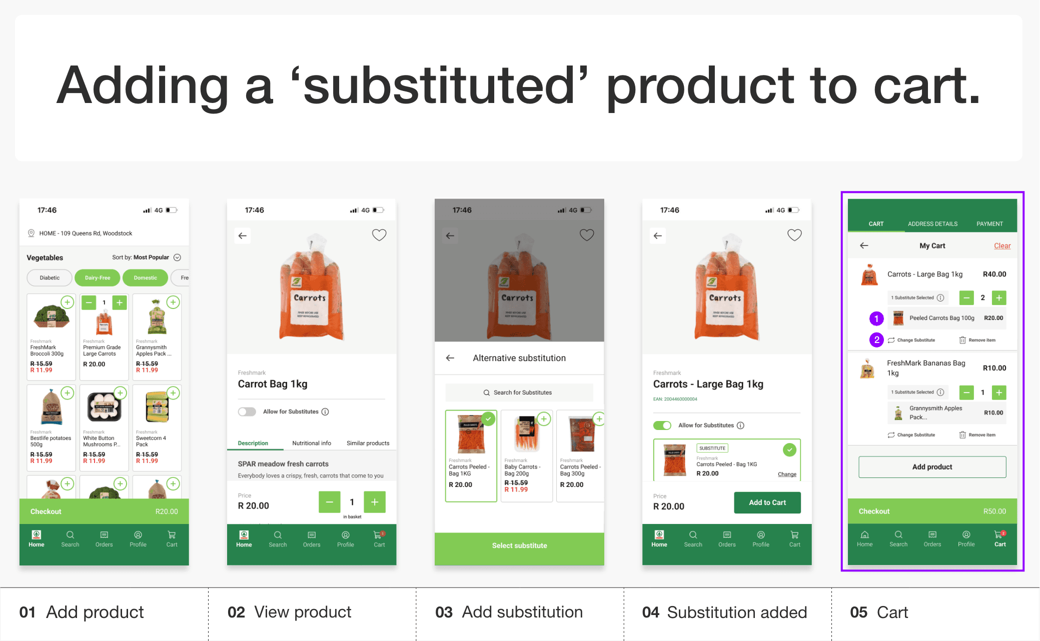

Our approach differed by keeping substitute choice visible and editable at checkout, rather than pushing it into a separate step.
Outcome 04
Positive feedback and increased user adoption since launch*
500k
downloads on the google play store to date
463%
increase in online sales between Sep 2023 & Mar 2024
303%
increase in store coverage since official roll-out
*Important to note:
The app is accessible on both iOS & android. Metrics presented above are based on public facing data.
Phase 1 launched to market in under 12 months, initially across 100 stores nationwide, with expansion to 403 stores by February 2024.
These outcomes reflect the broader agency effort and the collective contribution of the PlusNarrative team.
category
UI/UX
Platform
Mobile app
Timeline
2022 (4 months)
tools
Figma & Miro
Role
Design Assist
Contracted by
Plusnarrative
01

02


Mike V. Design 2026 © All rights reserved